In recent decades, human-centred design has become a cornerstone of how digital products are made. The aim is to make using them as fast and seamless as possible: every interaction is optimised, every obstacle removed. This raises a question: what do we lose when design eliminates every form of friction?
This portfolio examines four artefacts that treat friction as a design tool rather than a flaw. It moves from a theoretical framework, through a set of web design guidelines, to practical tools that actively introduce friction into everyday internet use.
Emoticons Don’t Have Wrinkles
emoticons don't have wrinkles
The performance1, based on the Designing Friction2 manifesto, introduces friction as a tool for authenticity. It represents a paradigm shift in how we design digital technologies and how we work with them. With her face painted yellow, Luna Maurer creates a metaphor in which the emoticon stands for smooth, comfortable digital communication that in reality reduces the complexity of human interaction. In this way she challenges the idea that removing every obstacle leads to a better user experience.
Link to original Footnotes
MAURER, Luna. Emoticons Don’t Have Wrinkles. [online]. [cit. 4. 1. 2026]. Dostupné z: https://vimeo.com/1073615086 ↩
MAURER, Luna; WOUTERS, Roel; BARANCOVÁ, Alexandra. Designing Friction. [online]. 2023. [cit. 31. 12. 2025]. Dostupné z: https://designingfriction.com/ ↩
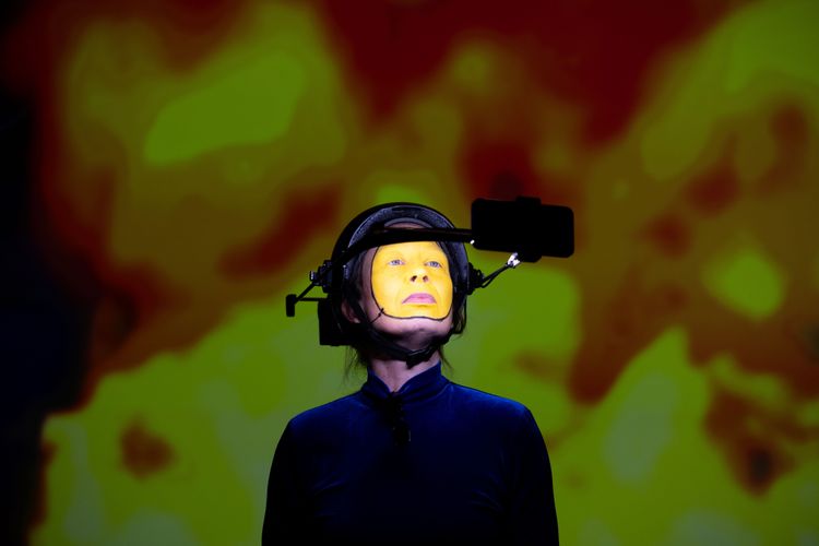
The manifesto proposes five ways of disrupting this seamlessness: discomfort, time delay, bodily engagement, non-positivity and unpredictability. The artefacts that follow put some of these principles into practice, giving users room to reflect: how much friction does it take for us to stop acting out of habit?
Guidelines for Brutalist Web
guidelines for brutalist web
The aim of the proposed guidelines1 is to focus on content and avoid visual elements that don’t directly make navigation easier. An ideal website built on these principles consists of hierarchically structured text, supplemented with buttons and hyperlinks where needed.
Link to original Footnotes
COPELAND, David Bryant. Brutalist Web Design. [online]. 2025. [cit. 31. 12. 2025]. Dostupné z: https://brutalist-web.design/ ↩
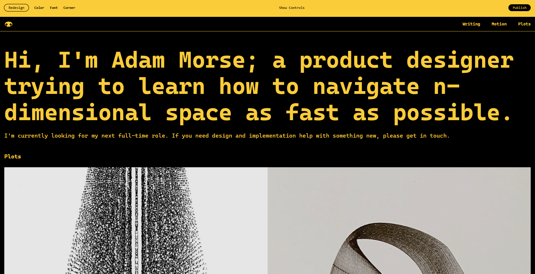
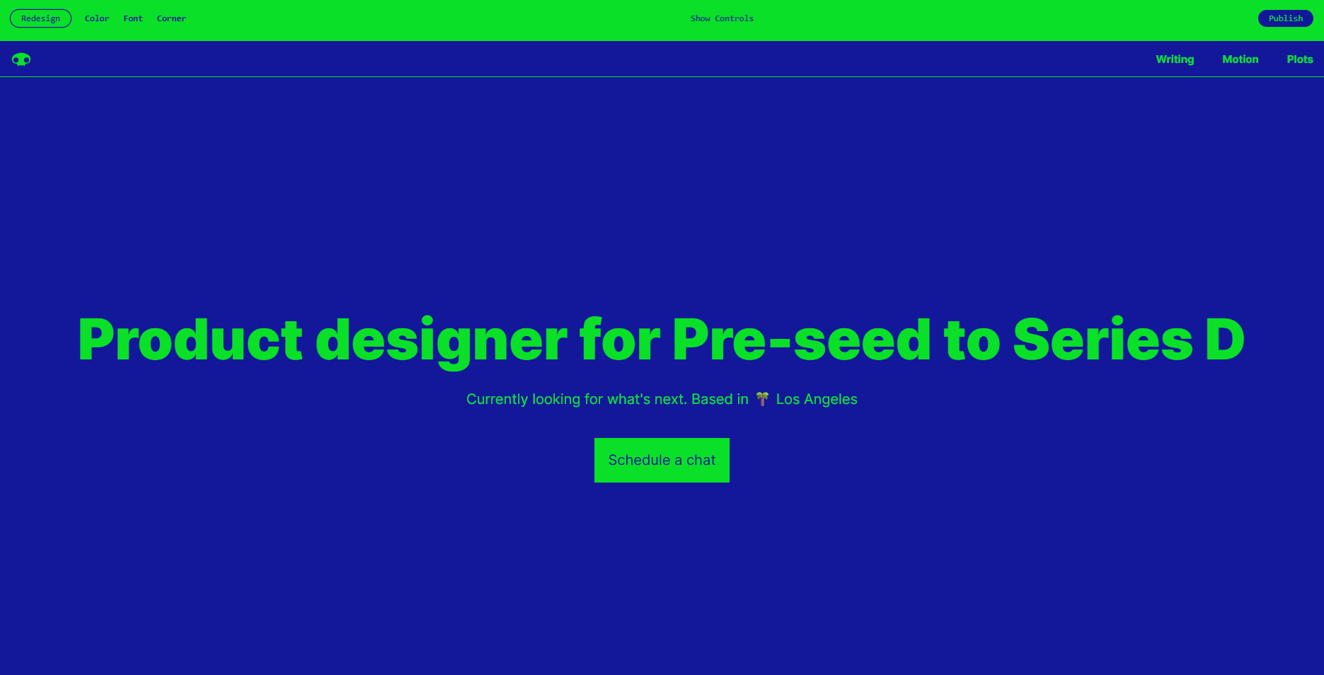
The images show an example of the brutalist approach to building websites. For a user accustomed to rich visual interfaces, this can cause a certain discomfort, much like the authors propose in the Designing Friction manifesto.
Ben Grosser – Textbook
textbook
The Textbook plugin1 introduces a small amount of friction: it takes away the visual shortcuts that let users read content without consciously reading it. It deletes images and icons but leaves empty boxes in their place, visible traces that point to how much visual information we normally interact with. In this way it disrupts the familiar rhythm of passive scrolling, creating a discomfort that pushes us into a mode of active exploration.
Link to original Footnotes
GROSSER, Ben. Textbook. [online]. 2017. [cit. 31. 12. 2025] Dostupné z: https://bengrosser.com/projects/textbook/](https://bengrosser.com/projects/textbook/) ↩

This concept also relates to non-positivity. By hiding elements such as “like” icons, emoji and the photos themselves, the plugin removes the positive visual cues that often make social media pleasant and instantly engaging.
While the brutalist web applies friction at the design level (creating), Textbook introduces it at the user level (removing). Both, however, share the belief that less decorative content means more attention.
absurd.website – Slow Internet Simulator
absurd.website
The Slow Internet Simulator1 plugin deliberately slows down how web pages load, taking the user back to the era of dial-up connections over a landline and modem. Pages load slowly. Users accustomed to instant response are confronted with their own impatience, and every second of waiting reveals how dependent we are on instant access to information.
Link to original Footnotes
ABSURD.WEBSITE. Slow Internet Simulator. [online]. 2025. [cit. 3. 1. 2026]. Dostupné z: https://absurd.website/slow-internet-simulator/ ↩
The plugin works with time delay, and in doing so makes us reconsider whether friction really is synonymous with negativity and malfunction.
Textbook and Slow Internet Simulator don’t create new designs, but together they show that friction doesn’t always have to be designed from scratch: it can also be added to the digital world after the fact.
The portfolio shows that not every slowdown, complication or mild form of resistance is a step backwards. It moves from a performance that offers a vocabulary for understanding friction in digital design to artefacts that can be read through that vocabulary, even though they were created independently of it.
It turned out that discomfort and time delay are principles that can be implemented in a variety of ways, while bodily engagement, non-positivity and unpredictability remain an open challenge for further exploration.
All the artifacts share the belief that every obstacle removed also takes something away from us, whether it is patience (Slow Internet Simulator), the capacity for critical reading (Textbook, Guidelines for Brutalist Web), or even room for our humanity (Emoticons Don’t Have Wrinkles).
The portfolio presents friction as a tool for returning to conscious action. These proposals don’t call for going back to the past, but for rethinking what good design actually means.
